
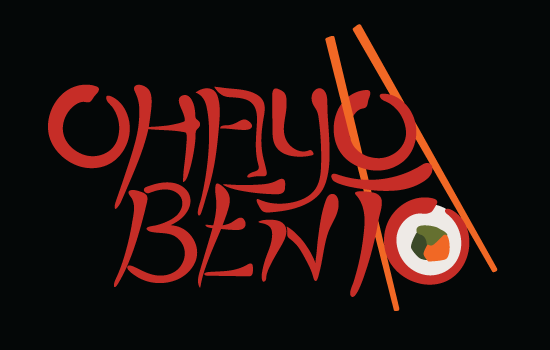
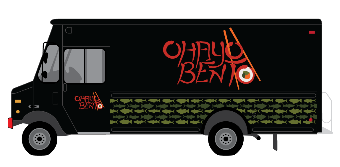
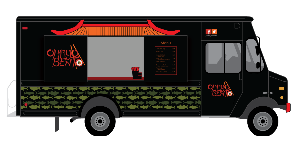
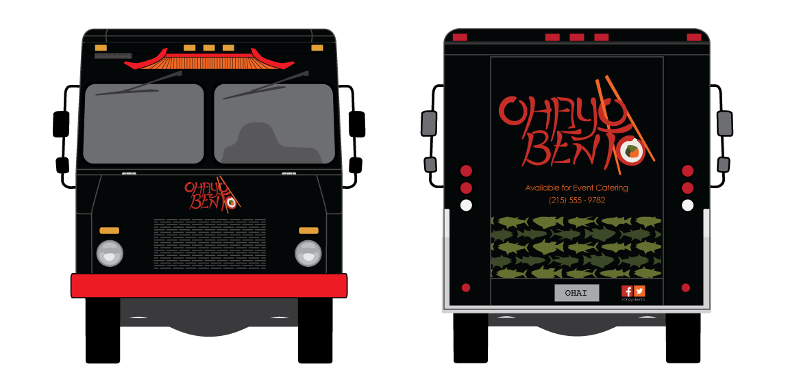
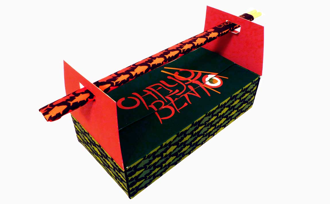
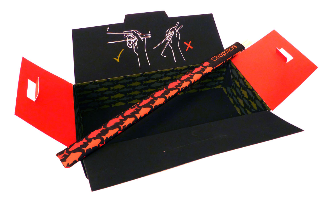
Ohayo Bento Food Truck
The objective was to create a food truck that would be able to set up on the West Chester University of Pennsylvania campus. After finding the Japanese food options to be lacking, I decided to design a sushi truck. The logo is hand done to give it the appearance of calligraphic inked letters. I chose red as the logo color because in Asian culture it represents good luck and it tends to provoke the viewer’s appetite. The fish pattern along the sides of the truck and take away box are all types of fish commonly used in sushi. The box is made to carry anywhere between four and eight sushi rolls and uses the included chopsticks as the carrying handle.
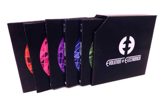
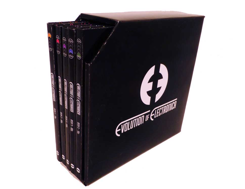
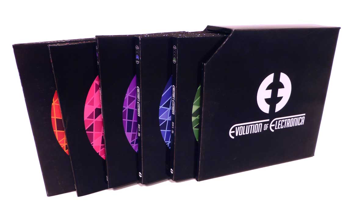
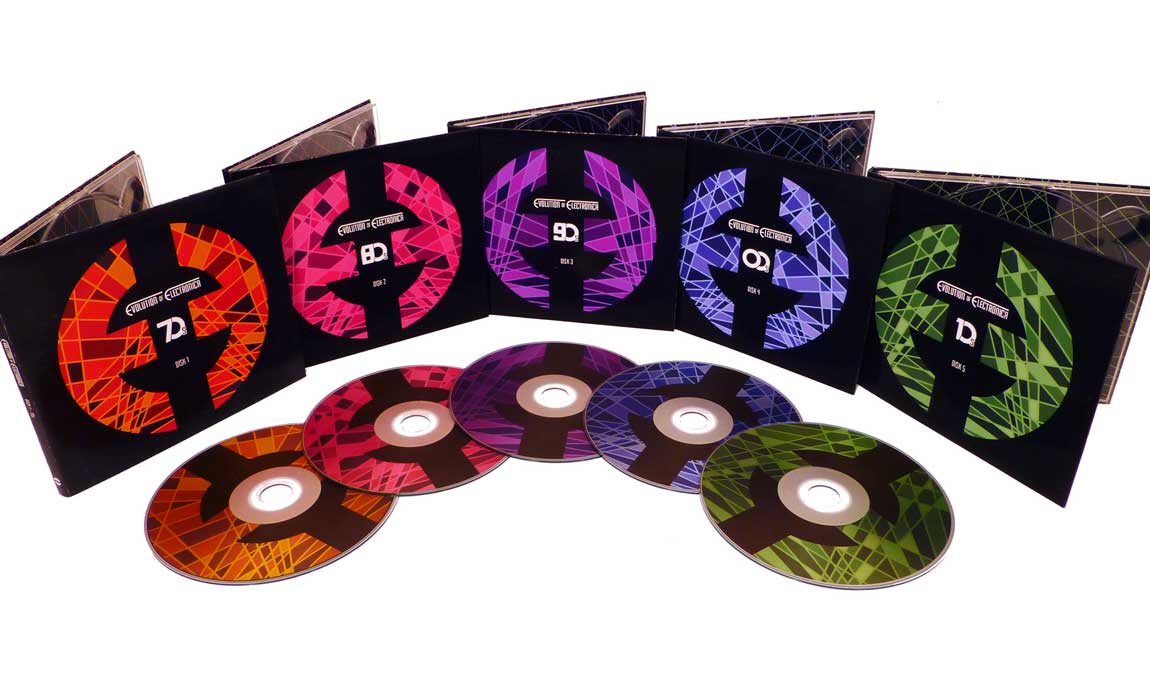
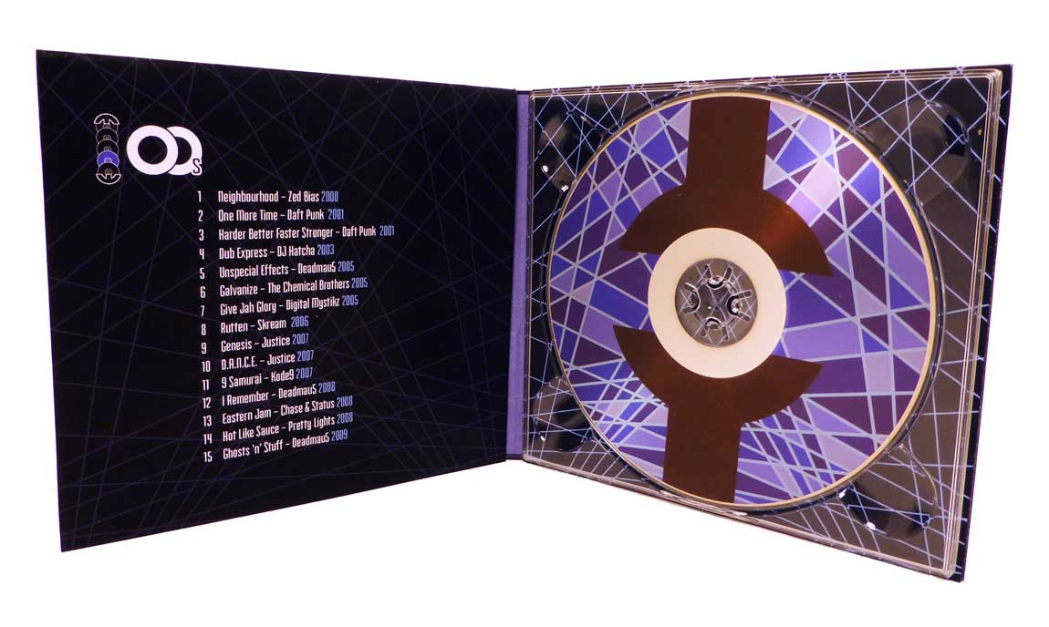
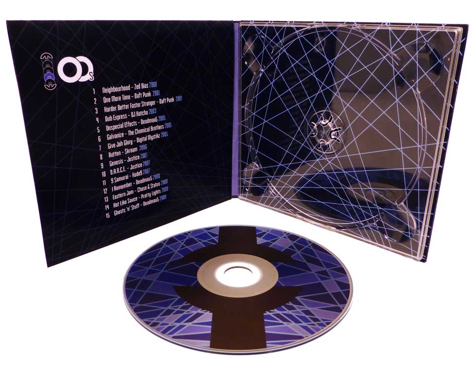
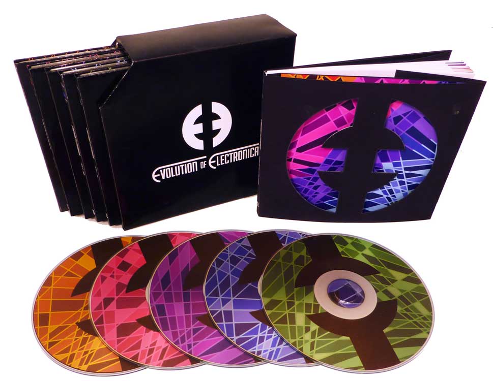
Evolution of Electronica
This was a topic of my own choosing. I decided to explore the development of EDM (electronic dance music) through the past fifty or so years. I created a five disk set, each disk covering the most influential songs from a decade of electronic music. Also included is a small book outlining the differences between the various sub genres of electronica, such as techno, electro, house, and trance. The album and disk art is inspired by the laser light shows that commonly accompany this music in either a concert or night club venue. The name “Evolution of Electronica” quickly turned into a double E logo, the letter forms creating the shape of a disk.
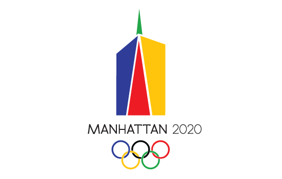
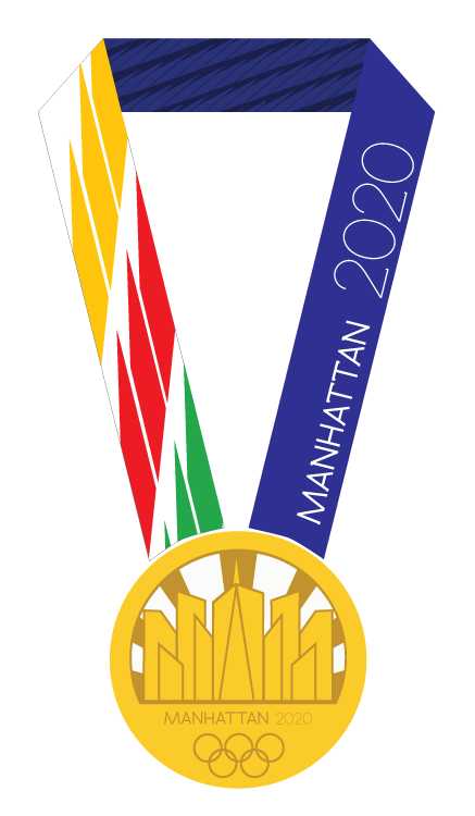
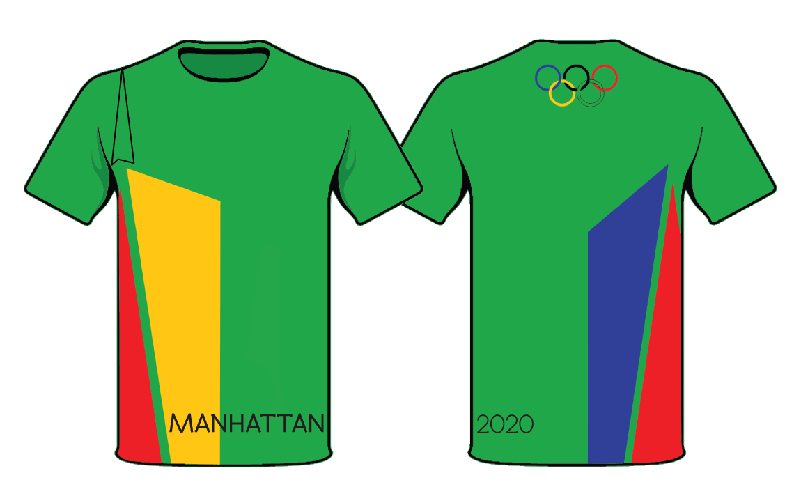
2020 Manhattan Olympics
For this project I was tasked with the creation of a logo for the fictional summer Olympic games hosted in Manhattan. I drew inspiration from the city’s skyline, specifically The Freedom Tower. The angles of this building give it a sense of energy and movement that I feel reflects the Olympic activities very well. I pulled that same angular style into the event icons, keeping them bold, simple, and stylized. For the medal i was sure to give the other buildings in the skyline the angular feel as well to continue that sense of movement.
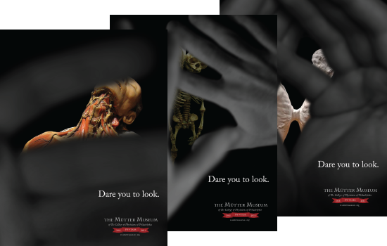
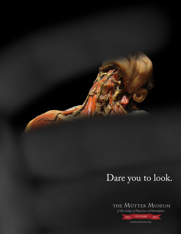
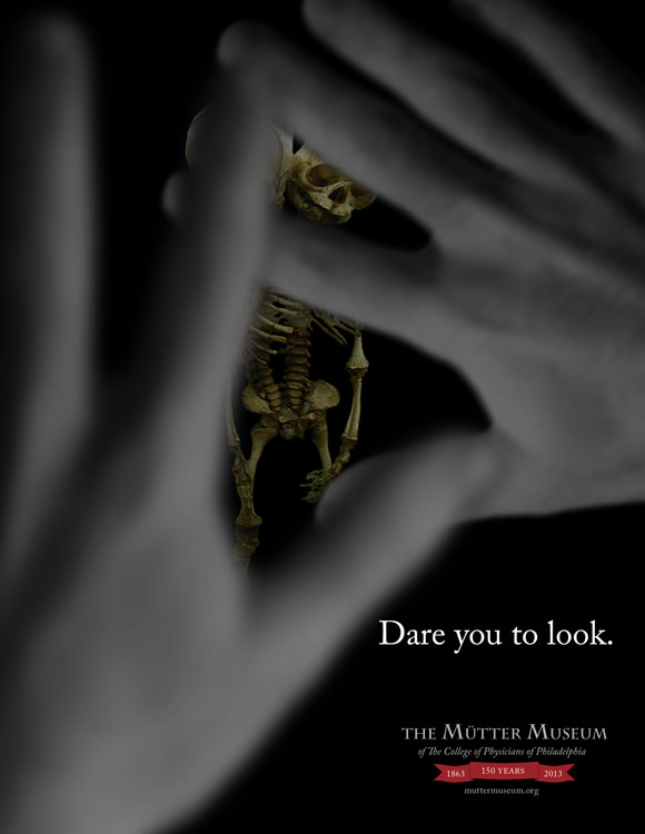
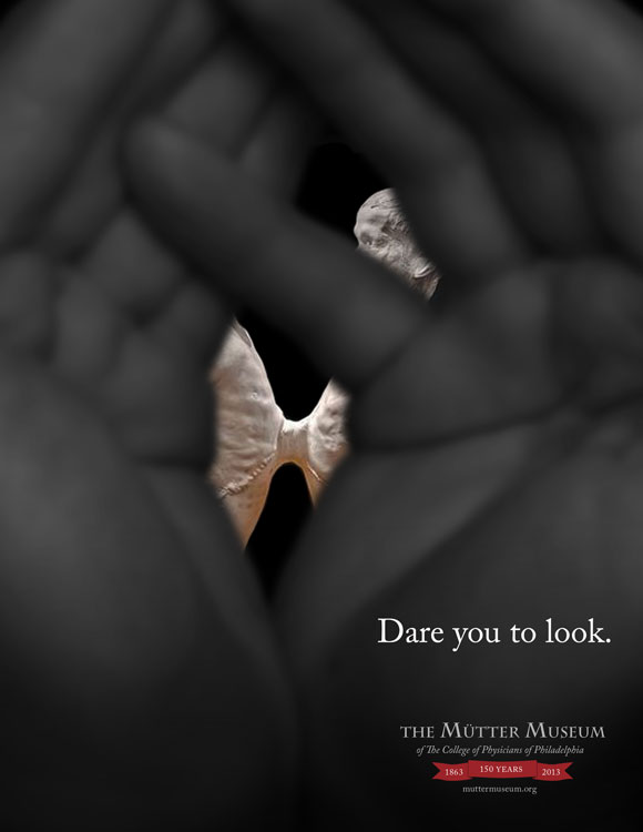
The Mutter Museum Ad Campaign
For this project my partner and I were tasked with creating an advertising campaign promoting the Mutter Museum in Philadelphia for its 150 year anniversary. The tag line we created is “dare you to look.” The idea came from the reaction that someone might have when seeing the grotesque displays in the museum, throwing their hands up to hide their eyes. We’ve all done this, but we always peek through our fingers to satisfy our curiosity. The ad series shows three displays from the museum through cracked fingers, giving the viewer a taste of what is there. The tag line acts as a call to action for the reader, challenging them to go to the museum and take a peek at the displays.
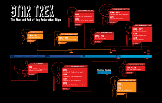
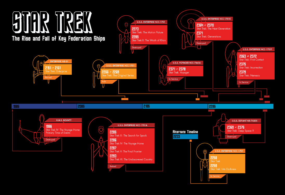
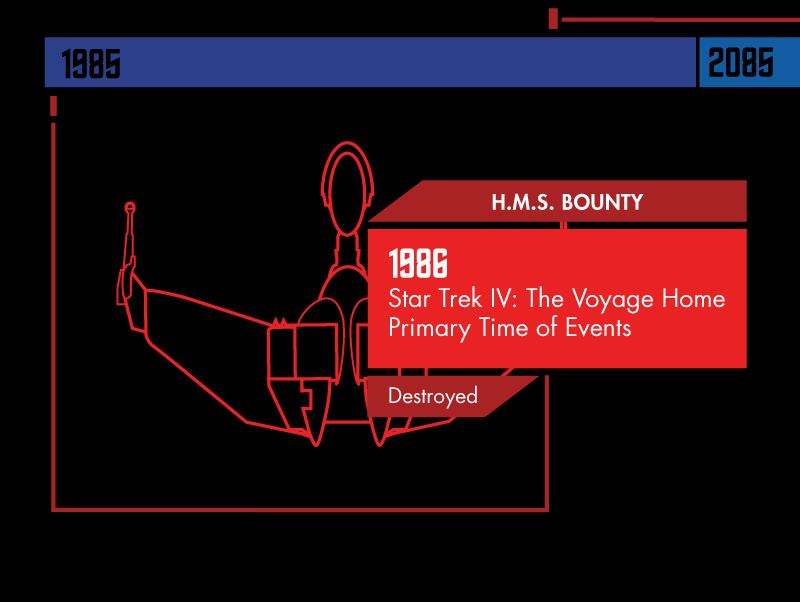
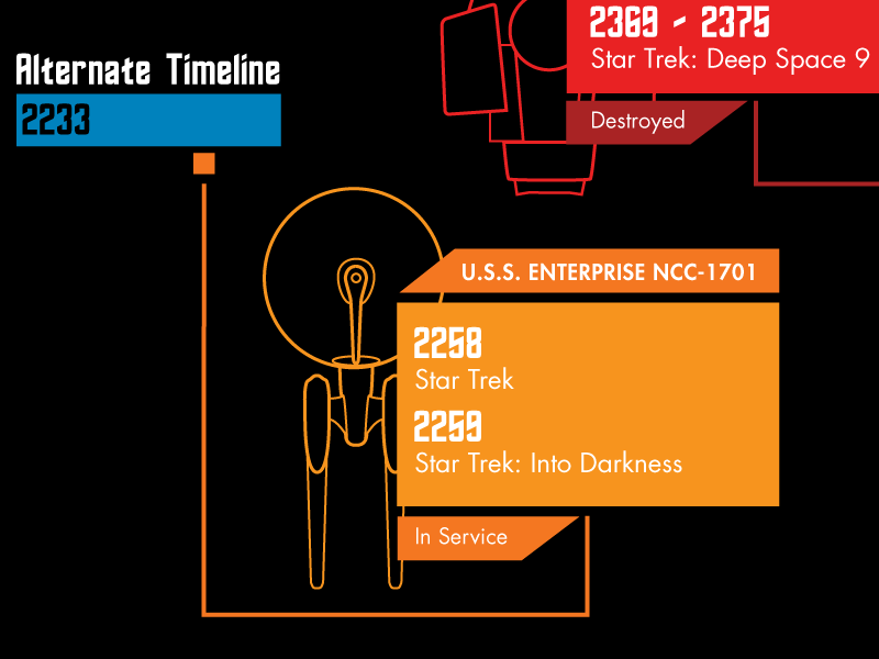
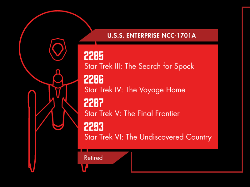
Star Trek Infographic
For this info-graphic I decided to use the popular television and movie series: Star Trek. I highlight a 400 year period that is covered in the various series of shows. All the colors were chosen because of their relevance to the officer’s uniforms, red and gold being the command colors in certain time periods. Blue is another color that is very present in the uniforms across all of the time periods, but is never a command color. I felt this would work best as the color of the time-line itself. The information includes a schematic like line drawing of each important federation ship as well as their names, service dates, current states, and which films they are included in.
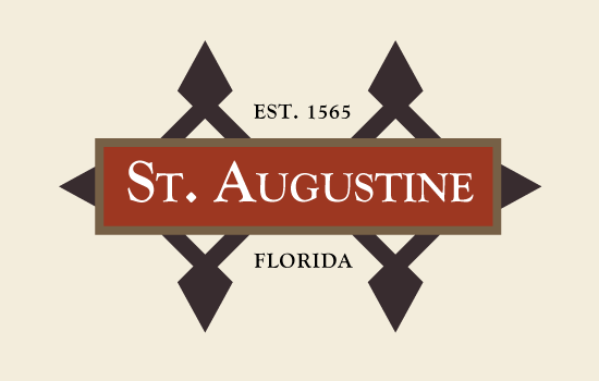
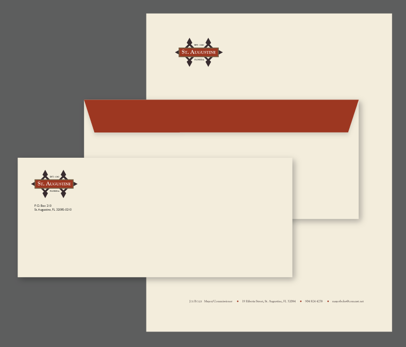
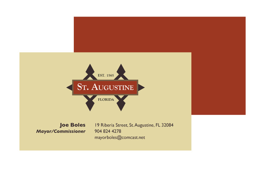

St. Augustine, Florida Rebranding
The task here was to re-brand a small town in America. I chose St. Augustine Florida because it has the unique characteristic of being the oldest Spanish Colonial town in the country. I chose to use some brown and cream colors to give the stationary and website an older, rustic look. The red I chose is inspired by the iconic roof work of the town. The logo highlights the age of the town by including it’s established date and the shape of the old Spanish Fort that resides in the town. I felt that this fort worked well as a recognizable landmark and a repeatable shape.
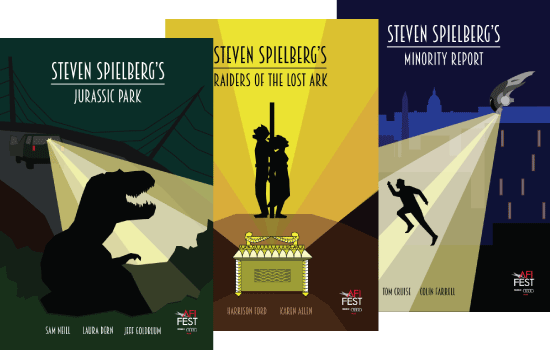
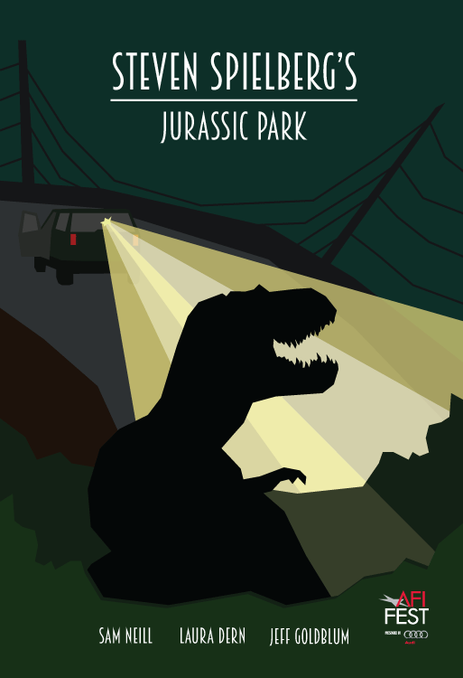
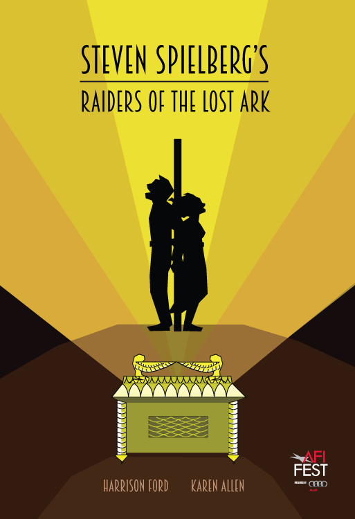
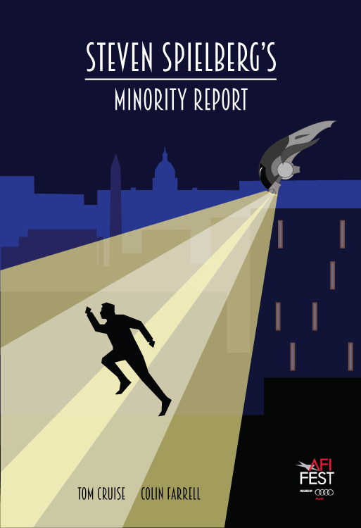
AFI Fest Directors Series: Steven Spielberg
These are posters created to promote the American Film Institutes director award candidate Steven Spielberg. I felt that giving the posters a 1920s art deco style would work well to pay homage to this director by giving some of his best films an older, distinguished appearance. I decided to choose well known scenes from each film that could best accommodate the iconic light rays from similar 20s posters. The deco text and the light rays work to keep the posters looking like they belong together and highlight the important characters and objects from each scene.